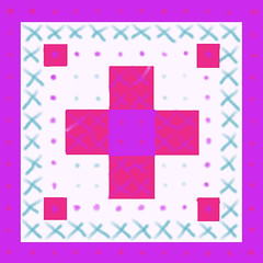
I am trying to put in some time learning Painter 12, and this is today's exercise. I decided to use the composition grid and digital pastel. The design looks simple (and it is), but I learned a lot about how some of the Painter 12 controls work. (At one point, I couldn't seem to make a mark with the brush, for example, which is the kind of thing that makes me panic.) But I love Painter so it is worth putting in the time to learn it. I have noticed a difference from Painter 11 in how the images look when posted. The colors don't look flat. I thought it might be because I was using digital oil pastel, so I switched back to digital pastel. But now I think the problem might be that I changed the resolution.
Friday, March 09, 2012
Subscribe to:
Post Comments (Atom)

No comments:
Post a Comment