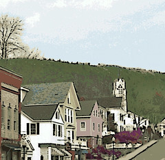
Today's adventure was a drive to Maine. We met our friends for lunch in Camden and it was wonderful to see them! I enjoyed seeing Camden, a place I had never been before. I liked this view of the hill overlooking the town. The original photo was cluttered with cars and pedestrians, so I decided to see what I could do with some digital editing. I used a combination of cut-and-paste and digital pastel to clear the street of cars and people. Then I applied a digital woodcut effect and some color overlays to try to capture the feeling of Camden on a chilly day in early spring.
Saturday, March 31, 2012
Friday, March 30, 2012
Quick View of Boston
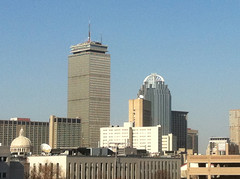
This is a photograph that I took on March 20th in Boston. We drove in to Boston for an event on Northeastern's campus, and after getting completely turned around, we found the parking garage. Lucky, we found a great space. Even luckier, the space had a great view of Boston, so I got out of the car and took this picture with my iPhone cam. It had to be a quick picture because we were heading to a lecture. But I got lucky with this shot. This is how it the photo looked right out of the camera.
Thursday, March 29, 2012
Landscape in Four Colors
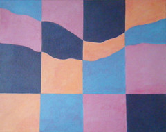
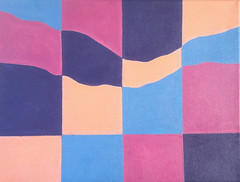
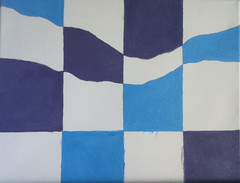
Here is the photo of my painting as it looked this morning. I think it is done. (I am never completely certain.) At least I can say for sure that this is the image that I submitted for a juried show. I have been planning to put a pink glaze over the painting, although I hesitated. But late yesterday, I decided to go for it. I mixed some matte acrylic medium with a bit of crimson to get a transparent pink glaze. I tried it out over some paint strokes on the back edge of the canvas and decided I liked it. I wanted to create some shimmer and movement and make the colors more lively. There is red in all four of these colors, so I thought a pink glaze would work. Besides, I have begun to think of this as a deconstructed sunset, so pink makes sense. I scumbled the glaze on, creating contrast with the controlled layers of flat color underneath. When I was in college, I learned color field painting, which aims to produce lines so perfect and a surface so flat that no brush strokes show. It was interesting, but I soon rebelled and began to juxtapose flat color field surfaces with biomorphic shapes and textures in my paintings. So I guess I am still rebelling. Last night, with this little deconstructed landscape, the final layer of glazing lets the brush stroke and the human gesture have the last word.
Wednesday, March 28, 2012
Landscape in Four Colors (As of Mar. 27, 2012)
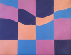
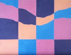
Yesterday I worked on this painting in the morning and again in the afternoon. I repainted the pink, lighter this time, and then added a little pink to the orange. I also repainted the blue, trying to correct mistakes as I went along. This is about as far as I can go with the time I have. (I am planning to submit this to a show, deadline coming right up!) But I have been thinking about adding a pink glaze and tonight I finally did. That was the final step, and I plan to post that here tomorrow.
Tuesday, March 27, 2012
Landscape in Four Colors (As of Mar. 26, 2012)
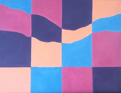
This is a work in progress, an landscape in four colors done in acrylic paint on canvas. It is a kind of desconstructed landscape.Here is how my painting looked yesterday afternoon when I had finished working on it for the day. I mixed up some blue, putting in a little bit of pink to give it depth. (It's hard to match colors with acrylics because the paint will look slightly darker when it is dry.
Monday, March 26, 2012
Landscape in Four Colors (As of Mar. 25, 2012)
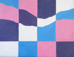
Yesterday I worked on this painting for a while. I am using the basic shapes of a landscape and painting those shapes in four colors, running them through a kind of grid. I chose four colors that one might actually seen in the sky or on the earth at different times of the day. I had already laid in all four colors (purple, pink, blue, and apricot). So yesterday I painted in a second coat of purple. I modified the color to make it a little richer, and tried to straight out the lines as I went along. Then I painted on a second coat of pink, which I also modified to get a richer color. Now it looks like a dusty rose, and reminds me of the colors I see in the Colorado landscape. But I want the pink to be lighter, so I will probably put on another coat of paint, to glaze it down a bit. To be continued. . . .
Sunday, March 25, 2012
Landscape in Four Colors (As of Mar. 24, 2012)
Here is my painting-in-progress as it looked yesterday when I finished working on it. I laid in the fourth color (apricot). This is just the first layer, but at least I can see how the composition is going to look. To be continued. . . .
Saturday, March 24, 2012
Landscape in Four Colors (As of Mar. 22, 2012)
This is a work in progress, an acrylic painting that I started recently. The idea is a mountain landscape in four colors, with the position of the colors changing through a grid. I chose four colors that can be seen in the sky at various times of the day. This is how the painting looked on Thursday after I had blocked in the pink, which is the third color.
Friday, March 23, 2012
Landscape in Four Colors (As of Mar. 21, 2012)
Yesterday I posted a crayon sketch (on an index card) of my idea for a landscape painting in four colors. I want to show changes in the way the landscape looks with the colors in different areas. On Wednesday, I measured the canvas and established the lines. Then I began laying in the colors, starting with blue and then purple. I am using acrylic for this project. I kept looking at my little crayon sketch to make sure I was putting the colors in the right place. This is how the canvas looked when I was through painting for the day.
Thursday, March 22, 2012
Sketch for Painting (Landscape in Four Colors)
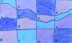
I have been considering ideas for a painting that suggests change (for a theme show). My recent designs with squares and circles got me thinking about doing a series of paintings of squared circles in different colors, and I even made a rough sketch. It's a good idea, and I will use it sometime soon. But I decided I wanted to do a progression with color in a single painting. Then I thought of doing a landscape divided into four sections and show a progression with four colors. When I got this idea, I was making coffee, filling the dishwasher, and trying to get my day started. But I stopped what i was doing and worked the idea out on some index cards with crayon. This idea combines my mountain landscapes with the old color field painting that I used to do back in the 1970s. The numbers on the index card refer to the colors: blue, pink, purple, and salmon, for colors that all work for both sky and land. On the basis of this little index card, I decided to create the painting. This is for a juried show so who knows if the painting will be accepted. But I am interested in the project anyway, so I decided to go for it. I am using acrylic for this painting because it makes a flat surface (good for hard edge painting) and because it dries fast. (Submission deadline is coming right up.)
Wednesday, March 21, 2012
Magnolias in Boston Back Bay (Posterized)
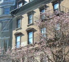
Tonight I decided to do a little post-production editing on the image that I posted here yesterday, early magnolias in bloom in Boston's Back Bay. In the original photo, I noticed some interesting light rays (probably reflected from the window) and I thought posterizing might enhance them. I also wanted to make those magnolias a little more noticeable, because they deserve it. So I used iPhoto to add saturation and lighten the shadows. Then I used Painter to posterize the image, experimenting with the amount of posterizing effect until I got the look I wanted.
Tuesday, March 20, 2012
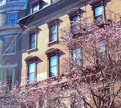
Magnolias in Boston's Back Bay
Today's adventure was a drive into Boston to attend a lecture at Northwestern University. It was a beautiful day for it, too, very warm weather for the first day of spring. As soon as we got off of Storrow Drive, I saw magnolia trees beginning to open. (This usually happens in mid-April!) I was in the passenger seat so I whipped out my iPhone camera and took some pictures. I like this shot of magnolias and Boston Back Bay architecture. Tonight I cropped this in iPhoto to get this composition.
Monday, March 19, 2012
Lynch Park Beach Low Tide

Here is another photo from yesterday's walk on the beach at Lynch Park. The tide was out so we could walk in places usually covered by the ocean. I used my iPhone camera to take some pictures. I was interested in the patterns of the waves coming in, and in this shot, the patterns in the sand. Tonight I used iPhoto to do some basic editing (straightening, cropping, and a little bit of beach cleanup).
Sunday, March 18, 2012
Gentle Waves at Lynch Park
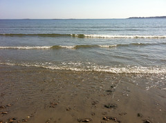
The weather was sunny and an amazing 70 degrees today, so we went to Lynch Park, a beach-front park here in Beverly, MA. The tide was out, so we took a long walk on the beach. It has been several months since I had a close-in view of waves coming in, and I was fascinated all over again. There was a lot to see, but I concentrated on taking pictures of the gentle waves as they approached to shore. This was the best of the photos I took today. Tonight I edited this in iPhoto, mainly just to straightening the horizon line and then cropping the image just a bit to get this composition.
Saturday, March 17, 2012
Stone Fences in Ireland
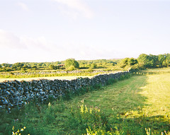
This is a photo that I took in Ireland back in the summer of 2004. We drove from Belfast to Galway, and stayed in a B and B in Oughterard, on the banks of Lough Corrib. Before we left, I took some pictures of the surrounding countryside. Tonight I edited the original version in iPhoto and am posting it tonight in honor of the Emerald Isle.
Friday, March 16, 2012
Composition with Three Patterns
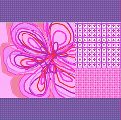
Tonight I decided to try out the "divine proportion" grid in Painter 12 (continuing my exploration of the upgrade). I used the Paintbucket tool to fill in the areas with three recent patterns. This sounds simple, and the process itself is easy, but it took a lot of fiddling about and many tries to get the size of pattern I wanted and to come up with a composition that I liked.
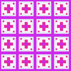
Thursday, March 15, 2012
Circles and Squares

Yesterday I continued my exploration of my new Painter 12 upgrade by using the grid and selection tool to square a circle and posted it here (in honor of Pi day). While I was at it, I capture a pattern from the image, and used it to make a new image filled with mad hot polka dots (posted here tonight). It was fun and I think this pattern might come in handy for future projects. It reminds me of some of the old color field paintings I liked and tried to do back in the 1970s.
Wednesday, March 14, 2012
Square and Circle

I am continuing my exploration of my Painter 12 upgrade. Today I used the layout grid and the selection tool to create a circle. I converted it into a shape, and then used the paintbucket tool to add two hot bright colors. Then I cropped it, using the grid to get as close to a square as possible. I am posting this tonight in honor of pi day. I also used this image to create a pattern (mad hot polka dots) which I plan to post here tomorrow.
Tuesday, March 13, 2012
Grid Pattern in Pink and Blue-Violet

A few days ago, I used Painter 12's grid to create a design, which I posted here. Yesterday I used that design to create a pattern. Last night's post was an image filled with the pattern I made. Tonight's post was made using the pattern in Painter's pattern pen. This looks simple, but I discarded many attempts to get the colors and placement where I wanted them to be. I even did a little "post-production" in iPhoto, straightening and one final crop.
Monday, March 12, 2012
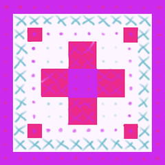
Grid Pattern 1
A few days ago, I made an image in Painter using a grid. As I was doing it, I thought about designing cross-stitch patterns on the computer (something I have done in the past). But I have also been told that it looks like a quilt. So I have been wondering what it would look like as a pattern. Tonight I used Painter's "capture pattern" and made a pattern from the original image. Then I used the "paint bucket" tool to fill a new image with the pattern. Then I cropped it, and here it is. Who knows, it might come in handy. I also did another image using this image in a pattern pen, and plan to post it here tomorrow.
Sunday, March 11, 2012
Chicken Collage Day 19 (March 10, 2012)
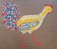
Since the last time I worked on this project, I took some time to look at images of various breeds of chickens, trying to get a better idea of the size and shape the wing should be. (This is an imaginary chicken, but still.) Over the weekend, I spent some time at Porter Mill Studios working on my chicken collage. I pasted down some pieces to widen the wing and establish the shape. I also pasted more black and white polka dot pieces into the tail feathers.
Saturday, March 10, 2012
Snow in the Morning
This morning there was snow on the ground, about two inches, and it was very beautiful! The weather prediction was for high thirties by mid-afternoon. The snow wasn't going to last, so I grabbed my iPhone and took some pictures with the camera. This is one of the best shots, through an upstairs window. Tonight I edited the original image in iPhoto, adjusting the exposure and contrast. I also used iPhoto's retouch tool to obscure an electric wire, and then cropped the result to get this composition.
Friday, March 09, 2012
Composition Exercise with Grid
I am trying to put in some time learning Painter 12, and this is today's exercise. I decided to use the composition grid and digital pastel. The design looks simple (and it is), but I learned a lot about how some of the Painter 12 controls work. (At one point, I couldn't seem to make a mark with the brush, for example, which is the kind of thing that makes me panic.) But I love Painter so it is worth putting in the time to learn it. I have noticed a difference from Painter 11 in how the images look when posted. The colors don't look flat. I thought it might be because I was using digital oil pastel, so I switched back to digital pastel. But now I think the problem might be that I changed the resolution.
Thursday, March 08, 2012
Signs of Spring
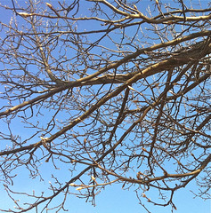
The weather was quite warm today (68 degrees), so we went for a walk at Obear Park. (Cooler temperatures are due to return tomorrow.) It was a very windy day, but the wind was even stronger at this waterfront park. It wasn't easy to take pictures in that wind! But I saw that some of the trees were budding, so I took my out my iPhone camera and took some photos. Tonight I edited this one in iPhoto.
Wednesday, March 07, 2012
Purim Flowers (Digital Oil Pastel)

This afternoon, I started a sketch in Painter with digital oil pastel, an idea that I had for a Purim: flowers made of hamentashen (triangular filled cookie). I worked on it some more tonight. I am not really satisfied with it (yet) but it was fun. And I am continuing to learn new things about the Painter 12 upgrade.
Tuesday, March 06, 2012
New Composition with Marbling

Tonight I continued my exploration of my Painter 12 upgrade. Tonight I used the layout grid again. Because I was short on time, I used the selection tool and paint bucket fill to create four horizontal bars, two purple and two aqua. I left space between the bars, so I was able to use the magic wand tool and fill the gaps with pink. Then I used the marbling effect, exploring the controls till I got this pattern. This was really fun. Maybe I can use these patterns to make things on Zazzle.
Monday, March 05, 2012
Digital Waves (Marbling)
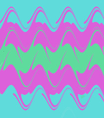
This is an exercise that I did tonight in Painter 12. I used the composition grid to create horizontal lines in a color scheme that I liked. These was tedious, but I am learning the new features of the Painter 12 composition tools. (And yes, it is still challenging to draw straight lines using a mouse.) The result was okay, but not interesting. So I decided to apply the marbling effect. I cropped the result to get this image.
Sunday, March 04, 2012
Hedge with Snow
The snow from two days ago is already gone, but I still have some pictures. Tonight I cropped this image out of one of my photos of the hedge with its vines coated in snow.
Saturday, March 03, 2012
Chicken Collage Day 18 (Mar. 3 2012)
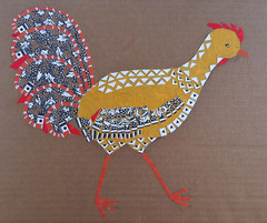
Today I spent a little time in the studio, working on this project, a collage of a chicken made up of patterns. (The idea of making an image of a chicken made out of patterns came to me last summer while I was admiring the chickens at Long Hill Garden.) Today I worked a bit on the tail feathers, and then added to the pattern on the back of the bird. I also started a new black and white pattern on the edge of the wings. I don't have a real plan, am just putting this together as I go along. I realized today that I am avoiding finishing the wing; I think I need to look at some pictures of chickens to check on the size and shape of their wings.
Friday, March 02, 2012
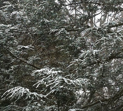
Snow on Pine Branch

It snowed last night, just a couple of inches, but it looked beautiful! I had to put the trash and recycling out this morning, so I put my iPhone in my pocket, and on my way back to the house, I took a few photos. Snow looks best early in the morning, I think. Tonight I used iPhoto to crop this image out of one of today's pictures..
Thursday, March 01, 2012
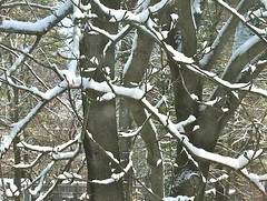
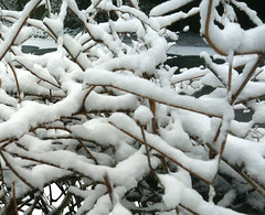
Snow on Evergreen
Here's another picture of yesterday's snowfall, taken closer to home. I love the way the snow outlines the shapes in the branches. Tonight I used iPhoto to crop this image out of the original picture. It has been snowing most of the day (and is still snowing). We aren't getting much accumulation (too warm for it to stick, really), but maybe there will be more snow photo opportunities by tomorrow.
Subscribe to:
Posts (Atom)