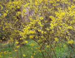
Here is another photo from last week's walk at Long Hill Gardens (April 1, 2012). The forsythia was in bloom. I liked the bright yellow and the curving lines of the branches. Tonight I used iPhoto to crop the image to get this composition.
Monday, April 09, 2012
Sunday, April 08, 2012
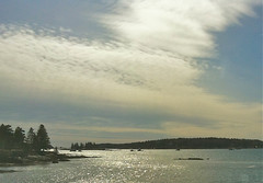
Evening Light in Maine
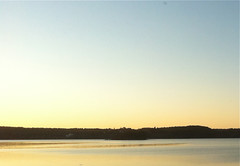
This is another image from last weekend's trip to Maine. By the time we left Spruce Head Island, heading for home, it was early evening. The light was beautiful so I started taking pictures with my iPhone camera. This photo was taken around 6:45 PM, and according to iPhoto and Google Maps, this is the Sheepscott River near Wiscasset Maine. In the original photo, the side-view mirror and part of the car interior are visible (I was taking photos from the passenger's side) as well as the guard rails on the bridge. But I was concentrating on the light and this view. Tonight I used iPhoto to crop this image out of the original photo. I sharpened it just a tiny bit to compensate for the radical crop, but the colors are just as the image came out of the camera. I think this might make a good subject for a painting; it would certainly be a challenge. Although the composition is simple, the colors are very subtle.
Saturday, April 07, 2012
Matza Ball Soup

Yesterday I made this little drawing of chicken soup with matza balls to use as an illustration to accompany a recipe in our food blog. This was for a family recipe, and I had been thinking about this drawing for about a week. Yesterday, before breakfast, I sat down and sketched imy idea in pencil. Then I finalized the lines with fineline marker and used my trusty crayons to add color. I had a great time! (If you want to see the blog post, go to Seasonings for Every Palate (seasoningsforeverypalate.wordpress.com) and find the post for April 6th, "Grandma Aptaker's Chicken Soup with Matza Balls."
Friday, April 06, 2012
Looking Up at Spring Blossoms
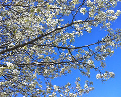
It was a busy day but we managed to fit in a walk at the Cummings Center Pond, despite pre-holiday weekend traffic tie-ups and last-minute errands. It was beautiful at the pond. The pear tree is in bloom, and I liked the way it looked against the bright blue sky so I took this picture. And as usual, when life seems too crazy is when it is most important to stop and look at nature, notice the changes that mark the seasons, be aware of the passage of time, and grateful for the blessings all around.
Thursday, April 05, 2012
Weeping Cherry at Long Hill
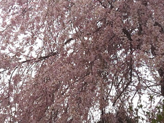
Last Sunday, we went to Long Hill Gardens, here in Beverly, MA. I had a lot of work to do, and thought I couldn't spare the time. And the weather wasn't great, too cold to tromp around the gardens. But as usual, when I saw the gardens, I changed my mind. Due to the spike in temperatures that we had a few weeks ago, lots of things are blooming early, so there was a lot to see. Even from the parking lot, I could see that this weeping cherry was in bloom. I took this picture when we got closer, shooting up towards the sky. Tonight I edited it in iPhoto, adjusting the lighting and saturation (to compensate for the colors I lost by shooting towards the white sky), and finally, cropping the image to get this composition.
Wednesday, April 04, 2012
Mom and Dad's Duet (Digital Woodcut)

A few months ago, I stumbled across a fading Polaroid snapshot of my folks playing piano. Although my parents played duets all the time, this was the only photo that I found of them at the piano. I might have taken it myself because it was in my own album, with other photos that I took during the 1970s. When I found the old photo a few months ago, I put it aside because I knew I wanted to do something with it. Today I scanned it in to my computer, then opened it in Painter. First, I used cut and paste and some digital pastel to simplify the background. Then I posterized it and added some color overlay, going for the iconic fuschia wallpaper (though perhaps this room was chartruese, but I am not sure.) Then I added the digital woodcut effect, applying it selectively to get the right amount of black where I wanted it. The last step was to straighten, crop, and retouch a bit in iPhoto, and here it is. This is a lot of work for a little photo, but it means a lot to me because this is how I remember them best. My mom played from sheet music and my dad played by ear, songs like "Taking a Chance on Love" and "Tea for Two" and other forties hits. I am posting this today because they were married on April 4, 1943. And although they have both been gone for some time now, there is still time for me to celebrate my luck in having such great parents.
Tuesday, April 03, 2012
Staircase in Camden, Maine
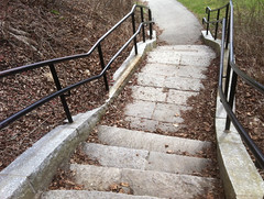
This is another photo from last weekend's trip to Maine. I loved this staircase that leads to the water front, so I took a picture with my iPhone camera. Tonight I used iPhoto to crop it to get this composition.
Monday, April 02, 2012
Chicken Collage Day 20 (April 2, 2012)
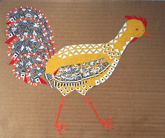
Today I went up to Porter Mill Studios and worked for a while on this project, a collage of a chicken made up of patterns. I spent about an hour working on the tail feathers, pasting in small pieces of polka-dot pattern. It is like working on a very tiny jig-saw puzzle. I think I made progress, but it is hard to see. I am prepared to be persistent.
Sunday, April 01, 2012
Near Spruce Head, Maine
Yesterday we drove up to Maine, heading for Spruce Head. The coast of Maine is unknown territory to me, so I had my camera ready. I was taking photos from the passenger seat; the views were too amazing to pass up. Tonight I edited this one in iPhoto. First I had to crop out the car mirror and interior that I had capture with my iPhone camera. Then I adjusted the shadows, highlights, and exposure. Then I cropped again to get this composition. This is quite an amazing place!
Saturday, March 31, 2012
Hillside in Camden, Maine (Digital Woodcut)
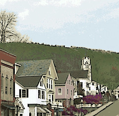
Today's adventure was a drive to Maine. We met our friends for lunch in Camden and it was wonderful to see them! I enjoyed seeing Camden, a place I had never been before. I liked this view of the hill overlooking the town. The original photo was cluttered with cars and pedestrians, so I decided to see what I could do with some digital editing. I used a combination of cut-and-paste and digital pastel to clear the street of cars and people. Then I applied a digital woodcut effect and some color overlays to try to capture the feeling of Camden on a chilly day in early spring.
Friday, March 30, 2012
Quick View of Boston
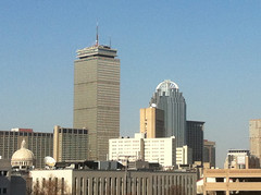
This is a photograph that I took on March 20th in Boston. We drove in to Boston for an event on Northeastern's campus, and after getting completely turned around, we found the parking garage. Lucky, we found a great space. Even luckier, the space had a great view of Boston, so I got out of the car and took this picture with my iPhone cam. It had to be a quick picture because we were heading to a lecture. But I got lucky with this shot. This is how it the photo looked right out of the camera.
Thursday, March 29, 2012
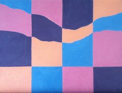
Landscape in Four Colors
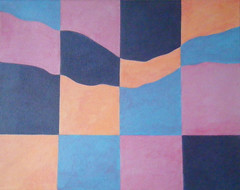
Here is the photo of my painting as it looked this morning. I think it is done. (I am never completely certain.) At least I can say for sure that this is the image that I submitted for a juried show. I have been planning to put a pink glaze over the painting, although I hesitated. But late yesterday, I decided to go for it. I mixed some matte acrylic medium with a bit of crimson to get a transparent pink glaze. I tried it out over some paint strokes on the back edge of the canvas and decided I liked it. I wanted to create some shimmer and movement and make the colors more lively. There is red in all four of these colors, so I thought a pink glaze would work. Besides, I have begun to think of this as a deconstructed sunset, so pink makes sense. I scumbled the glaze on, creating contrast with the controlled layers of flat color underneath. When I was in college, I learned color field painting, which aims to produce lines so perfect and a surface so flat that no brush strokes show. It was interesting, but I soon rebelled and began to juxtapose flat color field surfaces with biomorphic shapes and textures in my paintings. So I guess I am still rebelling. Last night, with this little deconstructed landscape, the final layer of glazing lets the brush stroke and the human gesture have the last word.
Wednesday, March 28, 2012
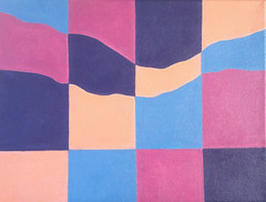
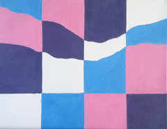
Landscape in Four Colors (As of Mar. 27, 2012)

Yesterday I worked on this painting in the morning and again in the afternoon. I repainted the pink, lighter this time, and then added a little pink to the orange. I also repainted the blue, trying to correct mistakes as I went along. This is about as far as I can go with the time I have. (I am planning to submit this to a show, deadline coming right up!) But I have been thinking about adding a pink glaze and tonight I finally did. That was the final step, and I plan to post that here tomorrow.
Tuesday, March 27, 2012
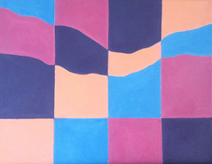
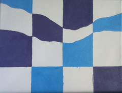
Landscape in Four Colors (As of Mar. 26, 2012)
This is a work in progress, an landscape in four colors done in acrylic paint on canvas. It is a kind of desconstructed landscape.Here is how my painting looked yesterday afternoon when I had finished working on it for the day. I mixed up some blue, putting in a little bit of pink to give it depth. (It's hard to match colors with acrylics because the paint will look slightly darker when it is dry.
Monday, March 26, 2012
Landscape in Four Colors (As of Mar. 25, 2012)
Yesterday I worked on this painting for a while. I am using the basic shapes of a landscape and painting those shapes in four colors, running them through a kind of grid. I chose four colors that one might actually seen in the sky or on the earth at different times of the day. I had already laid in all four colors (purple, pink, blue, and apricot). So yesterday I painted in a second coat of purple. I modified the color to make it a little richer, and tried to straight out the lines as I went along. Then I painted on a second coat of pink, which I also modified to get a richer color. Now it looks like a dusty rose, and reminds me of the colors I see in the Colorado landscape. But I want the pink to be lighter, so I will probably put on another coat of paint, to glaze it down a bit. To be continued. . . .
Sunday, March 25, 2012
Landscape in Four Colors (As of Mar. 24, 2012)
Here is my painting-in-progress as it looked yesterday when I finished working on it. I laid in the fourth color (apricot). This is just the first layer, but at least I can see how the composition is going to look. To be continued. . . .
Saturday, March 24, 2012
Landscape in Four Colors (As of Mar. 22, 2012)
This is a work in progress, an acrylic painting that I started recently. The idea is a mountain landscape in four colors, with the position of the colors changing through a grid. I chose four colors that can be seen in the sky at various times of the day. This is how the painting looked on Thursday after I had blocked in the pink, which is the third color.
Friday, March 23, 2012
Landscape in Four Colors (As of Mar. 21, 2012)
Yesterday I posted a crayon sketch (on an index card) of my idea for a landscape painting in four colors. I want to show changes in the way the landscape looks with the colors in different areas. On Wednesday, I measured the canvas and established the lines. Then I began laying in the colors, starting with blue and then purple. I am using acrylic for this project. I kept looking at my little crayon sketch to make sure I was putting the colors in the right place. This is how the canvas looked when I was through painting for the day.
Thursday, March 22, 2012
Sketch for Painting (Landscape in Four Colors)
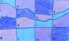
I have been considering ideas for a painting that suggests change (for a theme show). My recent designs with squares and circles got me thinking about doing a series of paintings of squared circles in different colors, and I even made a rough sketch. It's a good idea, and I will use it sometime soon. But I decided I wanted to do a progression with color in a single painting. Then I thought of doing a landscape divided into four sections and show a progression with four colors. When I got this idea, I was making coffee, filling the dishwasher, and trying to get my day started. But I stopped what i was doing and worked the idea out on some index cards with crayon. This idea combines my mountain landscapes with the old color field painting that I used to do back in the 1970s. The numbers on the index card refer to the colors: blue, pink, purple, and salmon, for colors that all work for both sky and land. On the basis of this little index card, I decided to create the painting. This is for a juried show so who knows if the painting will be accepted. But I am interested in the project anyway, so I decided to go for it. I am using acrylic for this painting because it makes a flat surface (good for hard edge painting) and because it dries fast. (Submission deadline is coming right up.)
Wednesday, March 21, 2012
Magnolias in Boston Back Bay (Posterized)
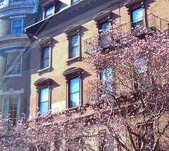
Tonight I decided to do a little post-production editing on the image that I posted here yesterday, early magnolias in bloom in Boston's Back Bay. In the original photo, I noticed some interesting light rays (probably reflected from the window) and I thought posterizing might enhance them. I also wanted to make those magnolias a little more noticeable, because they deserve it. So I used iPhoto to add saturation and lighten the shadows. Then I used Painter to posterize the image, experimenting with the amount of posterizing effect until I got the look I wanted.
Subscribe to:
Posts (Atom)